MEF is Now "Midtown-Metro Achievement Centers"
same mission, new brand identity
October 23, 2023
Midtown Educational Foundation (MEF), one of Chicago’s longest-running after-school and summer enrichment programs for urban youth, is taking its brand to the next level with a significant yet familiar change to its name and look. Starting today, the organization will begin to rebrand itself as “Midtown-Metro Achievement Centers.” With this new name comes new branding in the form of an exciting new logo and visual identity, all designed by an accomplished Agency Creative Director and Midtown alum, Bernardo Gomez. MEF will immediately begin to update its digital assets with the new brand identity. Physical assets, along with a full website redesign and legal name change, will be completed by May 31, 2024.
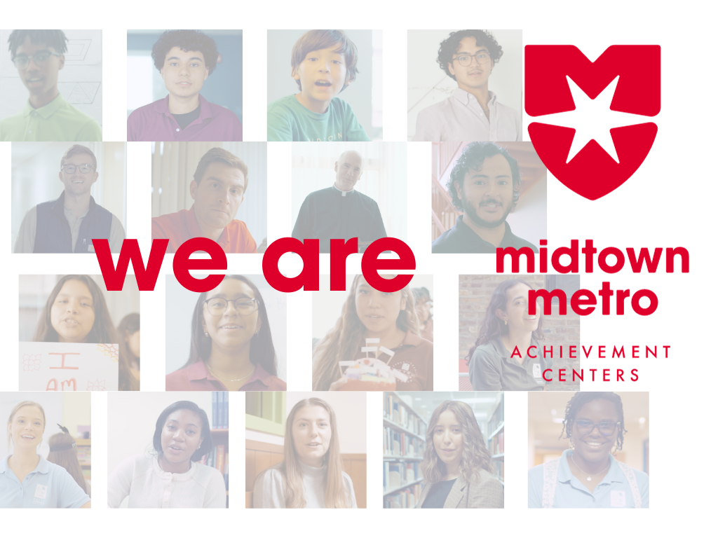
“We are Midtown-Metro” promo.
“This new organization identity has been a year in the making, with countless students, alumni, former staff, and board members supporting this project along the way. We are all so excited to evolve and energize this organization we love so much with a modern design that matches our character and better conveys our mission in its name. To be able to work with a designer like Bernie, who is a testament to the impact of our programs, only makes this process that much more inspiring. I am so proud to be leading this new era at MEF.
I am Midtown-Metro.”

The name
In addition to a call for a refreshed look, MEF conducted a complete brand analysis which concluded that a name change was also needed to better communicate its mission to the public. Instead of a radical name change, MEF opted to keep the name simple yet mission-focused with the new name Midtown-Metro Achievement Centers more clearly identifying that the organization is in the business of helping young men and women achieve success at its student centers, while also representing Midtown AND Metro equally in the primary organization branding. This naming structure is not new. Before this rebrand, the MEF website domain had been midtown-metro.org for over a decade, and many schools and community organizations had already been referring to the student programs as “Midtown-Metro” programs for their ease in describing us to their families.
Finally, like using a first name only in casual settings, the organization, as well as its two Centers, will be commonly referred to by their “first name” when around a familiar audience: Midtown-Metro, Metro, and Midtown.

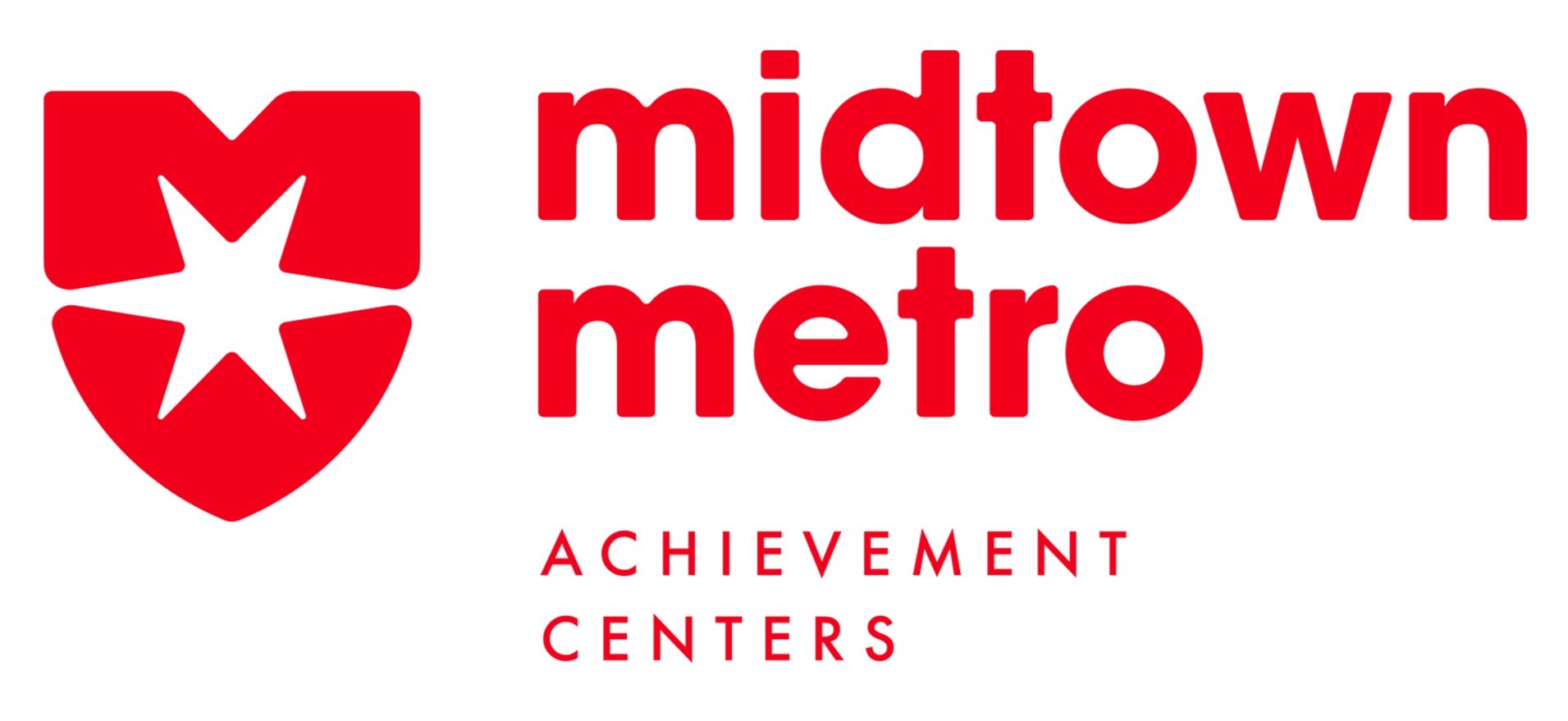
THE logo, The M/Shield/Star
With the Midtown-Metro logo redesign, Bernardo Gomez set out to create something simple enough to recognize, yet distinct and original enough that only this organization could be associated with it.
The design process was mindful of Midtown-Metro’s rich history and mission, yet Gomez wanted to create a mark for today’s visually sophisticated landscape. It needed to work on a table skirt during a school fair, a mobile device, and even embroidery on a baseball cap that can be worn by an audience ages 1 to 100.
Design exploration led him to take the “M” that is common to the brand entities and incorporate it into a universally recognized and classic shield shape. The shield stands for many strong and virtuous qualities, which is why numerous brands utilize it, including many academic institutions. Combine the shield with a rotated Chicago Star, as a salute to Midtown-Metro’s hometown, and we have a design that is simultaneously classic and youthful. Instead of being laden with symbols, the design inspires unique meaning and perception for each viewer.

THE colors
Three distinct color families serve to clearly delineate between Midtown-Metro, Metro, and Midtown.
Midtown-Metro Red
Metro Blue
Midtown Green
These particular hues were chosen for their positive associations with both academia and athletics which complement the organization’s deep history of using sports and physical activity as a vehicle for great mentoring sessions.
THE creative director and midtown alum, bernardo gomez

Bernardo “Bernie” Gomez is a VP, Creative Director for Edelman. He has over 20 years of high-level design and branding experience for clients such as Sprint, Citi, Coke, Mikes Hard Lemonade, Craftsman, Dish, ETRADE, and Hefty. He graduated from UIC with a degree in Graphic Design at the same time the previous MEF brand identity was created (coincidence?).
He also happens to be a Midtown alum, attending the program starting in elementary school at the original Midtown Center location on Loomis. Bernie hails from the Southside and knows all too well the struggles with gang violence and guns that our current students face today. He states that he owes his success in large part to his Midtown mentors, who stayed in touch with him well into adulthood and who introduced him to graphic design as a career path.
In addition to helping with this campaign, Bernie regularly gives back to Midtown by presenting each summer to our Graphic Design Apprentices at Midtown. He currently has his youngest daughter enrolled as a student in Metro’s One-on-one program.
Get Ready for More Developments In the Coming Months…
In addition to exciting new swag and Midtown-Metro merchandise that will be available, MEF is also launching a “We are Midtown-Metro” campaign featuring the many people, from students to board members, who have and continue to help guide MEF along pathways of success.
About Midtown Educational Foundation: Midtown Educational Foundation (www.midtown-metro.org), through its Metro Achievement Center for girls and Midtown Center for boys, has helped close the achievement gap for underserved students in Chicago since its founding in 1965. Their programs, which focus on academic excellence, virtue development, individual attention, and parental engagement, has led to 100% high school graduation and college enrollment for its students for over 20 consecutive years.
###
Media Contact:
Terry Sullivan
Email: tsullivan@midtown-metro.org